PUBG Player Role Analysis
Grouping professional players in Player Unknown’s Battlegrounds (PUBG) PCS Charity Showdown tournament into different groups of players using the k-means model. The tournament data will be scraped by selenium on the https://esports.pubgrank.org/ page. Building a simple regression model to analyze the relationship between the players from different clusters in each team and the team’s overall placement in the tournament.
TL;DR
Based on the elbow method, the model created 8 different clusters of players from the input data. Because of their distinct characteristics, I can label 6 clusters out of 8 total with titles: gunner, supporter, substitute player, and worst-performing player. The Adj R-squared value for the OLS regression is 0.754.
Background and Motivation
PlayerUnknown’s Battlegrounds (PUBG) Mobile is a game that just recently made me start to like video games again after six long years of me not playing any. It is an online multiplayer game developed and published by PUBG Corporation. Although I only played the mobile version of it, I love to watch different PUBG eSport tournaments and cheer for my favorite teams. In the middle of May of 2020, PUBG had an online regional tournament structure call the PUBG Continental Series (PCS) Charity Showdown. It is a series of global events wherein each region, teams will compete for $200,000 with $100,000 of that pot being donated to a charity of the winning team’s choosing. To me, this is a very exciting tournament for two reasons. First, my favorite team (Division X Gaming) is one of the teams from Vietnam to enter the final stage, compete with different teams in the APAC region, and won! The last reason is that it is a huge deal for any winning team to be able to bring that winning cash prize back to their countries to support the community during this crazy pandemic time.
Usually, in a team-based game, there are specific roles for each member of the team. Each role is associated with different responsibilities but ultimately they help to lead the team to its final goal. That is not so clear for this tournament because only some teams stated their players' roles. For this project, I will analyze all players' statistics in the final stage of the PUBG PCS Charity Showdown tournament to see if I can use machine learning to group players with similar characteristics together to form different groups. This will help me to identify different roles among all players and to see if there is any trend that associates with the overall team placements. To do so, I need to learn about a different type of machine learning compare to what I have used. This time, I will need to learn about clustering in unsupervised machine learning to segregate data based on the similarity between data instances. Here are some of the objectives I look forward to achieving for this project:
- Scrape table data from a website using
selenium - Improve my EDA skills
- Build a
K-meansclustering model to group players together
This will be a very fun project for me to do and will also be a very useful model to provide insightful information for PUBG esports teams analysts to see what type of players they have and what they need in order to be the best team. Here are some of the questions that this project can answer:
- How many types of players are there in the PCS Charity Showdown tournament?
- What are the players' roles that high placement teams have in common?
Prerequisites
Python Version: 3.7.4
Packages: selenium, pandas, numpy, matplotlib, seaborn, sklearn, kneed, statsmodels.
Project Outline
- Data Collection: I used
seleniumto scrape a table data from “https://sea.pubgrank.org/pcs-charity-showdown#information”. This website is very useful because it has all sorts of statistics related to the teams and players in the tournament’s final stage. I scaped three different tables: result, player stats, and kill/phase. - Data Cleaning: I unified all the teams' names to their abbreviation; remove the unit word (s, m, etc) for all values.
- Exploratory Data Analysis (EDA): explore different relationships between variables using graphs (line, scatter, bar, etc.) and heat maps.
- Model Building: build a k-means model with data from the “df_player” data frame; use the elbow method to determine the optimal number of “k”; created a simple OLS regression model to see whether different clusters of player per team has any relationship with the team overall placement.
Data Collection
I created this web scraper for table data through selenium to get the data from three different tables. Then, I exported these data into three CSV files. The general description of each data frame and its columns are listed below:
- Result (16,43): has the general information of all the 16 teams and their points (kill and placement points) for all 20 rounds (the entire final stage has 20 rounds).
- Player stats (66,12): contains more specific statistics of each of the 66 players; the 12 columns in the table are:
- player_rank = their overall rank
- player = player’s name
- match = match participated
- damages = total damage
- knock = total knock count
- kill = total kill count
- survive = the average survival time
- assist = total assist count
- longest = longest kill distance (m)
- traveled = total travel distance (km)
- accuracy = player’s firing accuracy
- main_weapon = main weapon that was used
- Kill/Phase (16,11): has the kill count of the 20 rounds from each team in 9 different phases (each round has 9 phases).
Data Cleaning
- Cleaned up text in teams name and change it to its abbreviation form.
- Return the current “survive” column time format (xx m xx s) to second.
- Remove the unit word (s, m, etc) for all values.
- Return the percentage value in the “accuracy” column to its decimal form.
- Created two new columns: “kill_per_match” (player’s average kill count per match) and “damages_per_match” (player’s average damage per match).
- Created a team placement for each player in the player data frame.
- Reformat the values in the kill data frame.
EDA
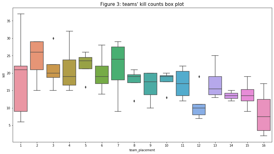
- Take a look at the dimensions of the three tables and their first five rows. The two data frames that I will focus on the most are “df_player” (player stats) and “df_kill” (kill/phase).
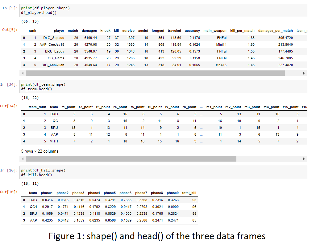
- The first variable I examine is the “kill” count. The distribution below seems to follow a bimodal distribution with the two modes are around 15 and 20. It does have one outlier with a value of around 39. Interestingly, the distribution is bimodal instead of (approximately) normal distribution. Maybe the median can act as a clear separation between the higher kills group and the lower kills group.
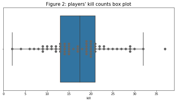
- Because the kill count is the main determination of the rank of the player. I want to see what kind of relationship does “kill” has with the overall “team_placement” by plotting a group of box plots below. In this figure, although not so clear, there is a trend that the higher the team ranking is, the higher the kill count range is. I am the most surprised by the 1st ranking team because it seems like, the team kills counts are quite low except for one outstanding player in the team with the highest kill out of all players in the tournament.
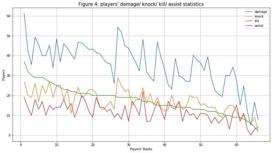
- Next, I compare the players' “damage”, “knock”, “kill”, and “assist” statistics. To do so, I need to unify all units of the variables (for “damage”, I divide the value by 100 because player health is out of 100). Interestingly, the trends for “damage”, “knock”, and “assist” are very similar while the kill count’s trend is very smooth. It is expected that, on the player’s average, the “kill” count would be higher than the knock count but lower than the damage dealt because players tend to steal kill (one player knock a player but the other finished him) of each other.
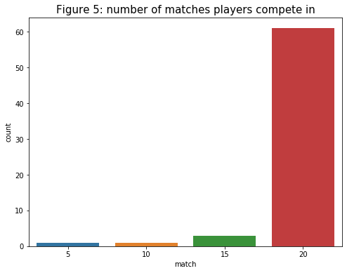
- For the number of “matches”, players compete in, I plot a histogram count plot to see how many substitute players are there. In the later part, I will do some comparative analysis between the group of main and substitute players.
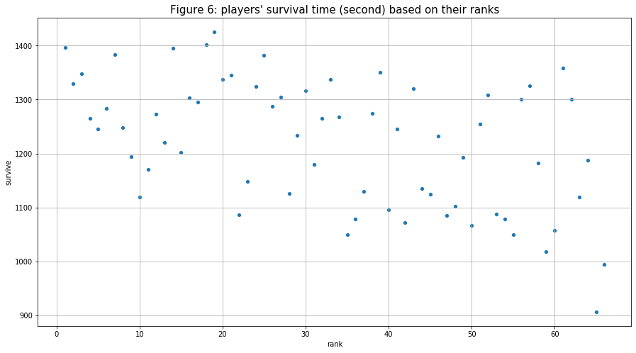
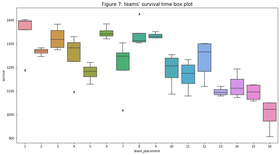
- Similar to the kill count’s trend, though not so clear and quite weak, the “survival times (“survive”) of players increases as the player’s rank (and “kill”) increases. It then can be said that the player that kills more has a higher chance of surviving longer in a match. We can especially see the trend very clearly when I group players that are in the same team for each box plot in figure 7. For the first ranking team, compensate for their average kill counts, it seems like the team got the most point from surviving into the later rounds.
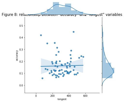
- I plotted the two variables (“accuracy” and “longest”) to see if they have any relationship. I assumed that the higher the player that has longer kill range is more likely to have higher accuracy compare to others. But the figure below shows that it is not true.
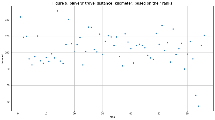
- The next relationship I want to examine is the travel distance (“traveled”) and players' ranks (“rank”). I assumed that the player with more kills would make more rotations compare to others to get the kill (or would rotate to a better place beforehand and wait for others to come). Based on the figure below, almost all player’s travel distances scatter around the 80 - 140 (km) range with two noticeable outliers that have values below 60. There does not seem to be any clear relationship between the two variables.
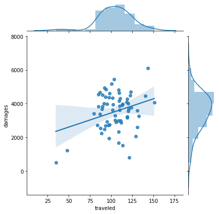
- Then, I tried using a different variable to see if I can create any connection with the “travel” variable. Interestingly, there does seem to be a weak but positive correlation between “traveled” and “damages”. This relationship might make more sense because the kill steal would have a big impact on the last relationship (between “traveled” and “kill”). But “damages” draws a better picture to help support my assumption.
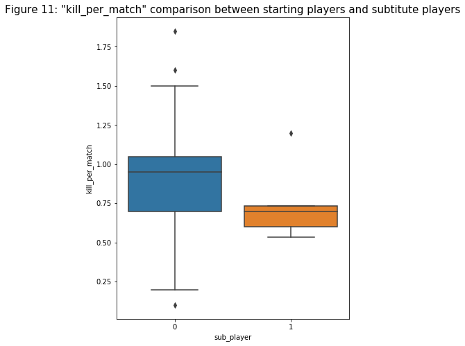
- I perform feature engineering to create a “sub_player” variable that returns binary numbers indicating whether a player is the main player of the team or a substitute based on the number of matches he played. Then I plot a box plot comparing the kills per match (“kill_per_match”) of the two groups to see if there are any major differences. Note that the number of substitute players is much lower so it might affect the analysis. Based on figure 11, there does seem to be remarkable differences between the two groups: the first quantile, median, and the third quantile are all lower for the substitute group. This would make sense because players in starting positions should perform better.
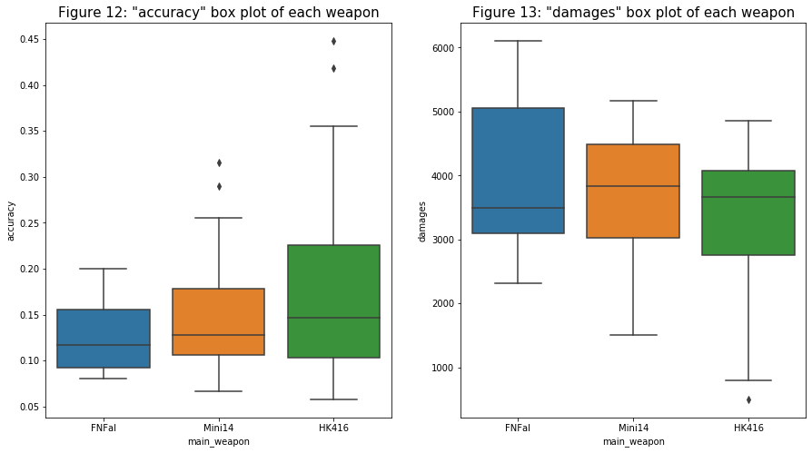
- For the “main_weapon”, I want to compare it with two other variables: “accuracy” and “damages”. For the first relationship in figure 12, it seems like HK416 (assault rifle) has a slightly higher accuracy compare to the other two weapons (designated marksman rifle). I can see why this is the case because a player has a better chance of shooting at his opponent in close range. In figure 13, it seems like a player that uses the FNFal has higher damage compare to the other two. Although it is harder to hit an opponent in long-range, FNal deals the most damage per hit out of all three weapons.
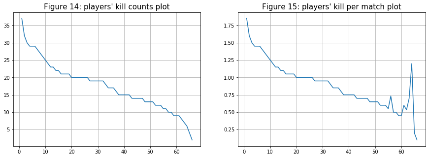
- For the next two comparisons, I was curious to see if there are any differences between the kill counts plot and the kill per match counts. As can be seen in the two figures below, after the 50th ranking player, there are spikes in kill counts per match compare to a smoother exponential decrease in the other one. These spikes might cause by substitute players since they play fewer matches but have a decent kill count.
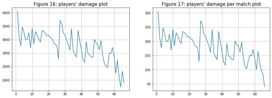
- The next comparison is for the “damages” variable. As expected from the result above, there are no major changes for the two plots except for players after the 50th ranking player.
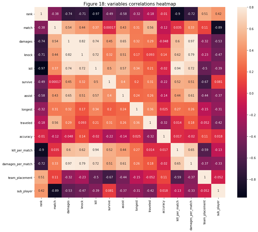
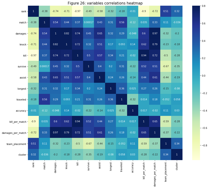
- Lastly, I created a correlation heat map to see if there are any relationships that I missed from above. As it turns out, there is not much to cover anymore. As expected for features that are the most correlated with the “rank” variable are related to or derived from the “kill” variable. All other relationships with high correlation are also ones that are derived from one another.
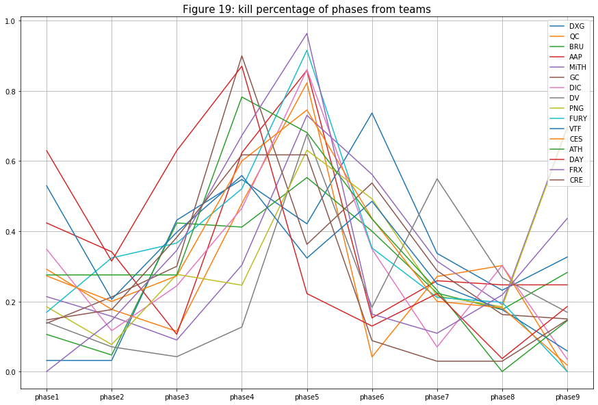
- Next, I want to examine the “df_kill” data frame to see the overall action of matches in the tournament. The figure below shows the kill percentage of different phases from each team. Those teams that have a high percentage in phase 1 are those that fight earlier in the game to claim their looting spot. Then tension slowly builds up to phase 4 or 5 where most teams will need to fight for their spots on the map. Although the percentage should continue to rise from here since the number of player decrease then so does the kill percentage (because there is less player to kill).
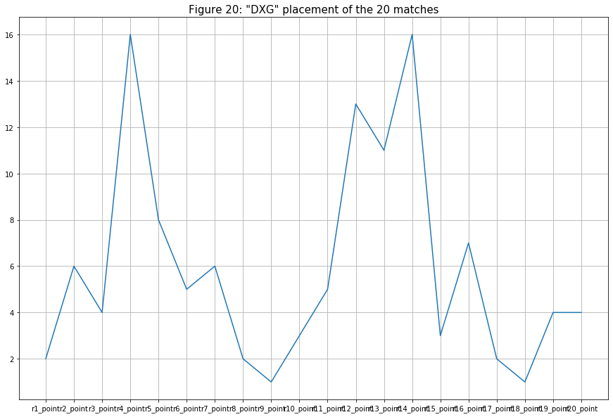
- For the last three plots, I want to examine the team’s placement pattern of three different teams (each from the top 5, top 10, and top 16 of the overall team placement). Figure 18 shows team Division X Gaming’s (DXG, 1st ranked team) team placement pattern. Interestingly, this 1st ranked team had about as many bad performance matches (ranked below 8th) as much as the good ones (ranked above 8th). DXG was the first team to exit a match twice (ranked 16th) but they did balance it out with two matches winning the Winner Winner Chicken Dinner (rank 1st).
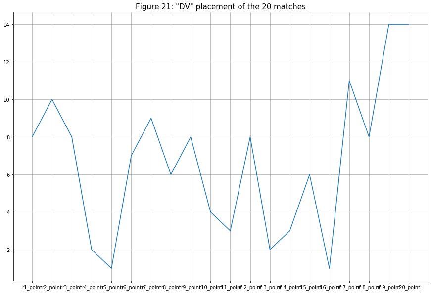
- The next team is Divine Esports (DV, ranked 8th). Their overall placement is pretty good (ranked mostly from 4th - 9th) for an 8th ranking team (though lower than DXG’s average). But similar to DXG, they also won two matches (ranked 1st) and lost two matches (ranked 16th). Maybe DV’s kill counts were not enough for the team to climb up higher on the leaderboard.
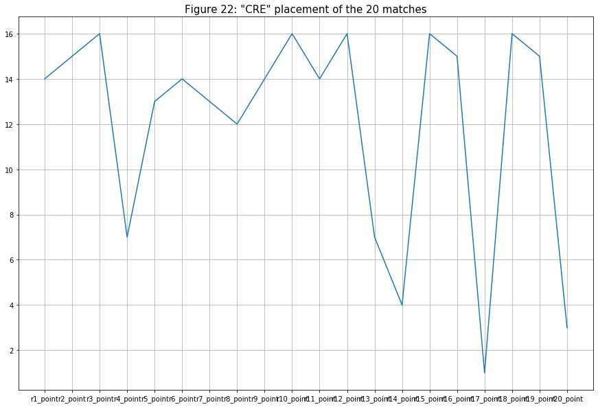
- The last team is Creatory Esports (CRE, ranked 16th). As expected from the last-placed team, their overall placement is not so high (but with occasional matches ranked above 5th place.
Model Building
Although we have three datasets, for the model building part, I will mostly focus on “df_player” since it has all the information we need to group players. Only one variable (“main_weapon”) in the “df_player” dataset is not numerical so I transform it from the categorical variable into dummy (numerical) variables.
I standardize features in the dataset using
StandardScaler()I created an unsupervised machine learning model k-means clustering to partition all the players into different numbers of clusters (k clusters). Although I had “n_clusters” = 2, it is only an assumption number. I choose 4 because each team can only have a maximum of 4 players play at a time. Usually, there are specific roles divided among the 4 of them hence why I chose 4. I will choose a better number later with a method called the “elbow curve method”.
kmeans = KMeans(n_clusters = 4, init='k-means++', random_state = 1).fit(data_scaled)
- Using the
inertia_attribute on to the “kmeans” model, it returns the sum of squares distances of samples to their closest cluster center.
kmeans.inertia_
Out[12]: 599.5196341063314
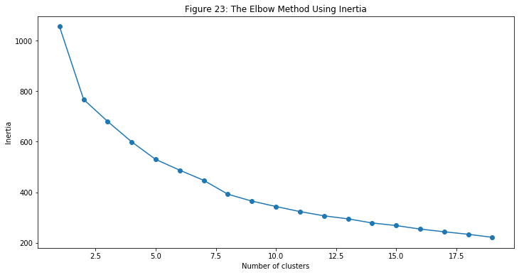
- Next, I created a for loop to initialize the elbow curve method (or elbow method). This is a very fundamental step for finding and selecting the optimal number for k (clusters) by fitting it with a range of k values. For each value of k, it calculates and plot the sum of squared errors (SSE).
SSE = []
for cluster in range(1,20):
    kmeans = KMeans(n_clusters = cluster, init = 'k-means++', random_state = 1)
    kmeans.fit(data_scaled)
    SSE.append(kmeans.inertia_)
frame = pd.DataFrame({'Cluster':range(1,20), 'SSE':SSE})
- I then plot the SSE using different values of Inertia (from 0 to 20).
- Python has a very cool library call
kneedthat has the functionKneeLocator. What this function does is it detects knee-point on the data. This is perfect for me because, to find the best k value, I need to select the value of k at the “elbow” (the point after which the inertia starts decreasing linearly). It will return the k value that we need for our cluster model.
kmeans = KMeans(n_clusters = kl.elbow, init = 'k-means++', random_state = 1).fit(data_scaled)
pred = kmeans.predict(data_scaled)
- The k value that
KneeLocatorreturns is 8, which means there are 8 different groups among the players. Here is a list of numbers of players in each of the clusters:
| Clusters | Number of Players |
|---|---|
| 7 | 14 |
| 5 | 12 |
| 2 | 11 |
| 0 | 11 |
| 1 | 8 |
| 6 | 4 |
| 3 | 4 |
| 4 | 2 |
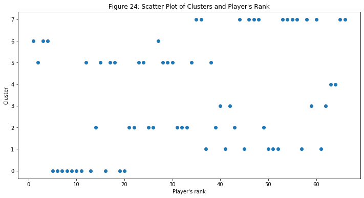
- I plotted a scatter plot with the player’s rank against the cluster variable to see whether we can see any pattern based on this relationship. There is not a clear pattern that I can determine based on this figure, which is good! Because this means that the model has also considered other variables and not just only the player’s rank (or kill count). We will look at the cluster variable with some other ones later in the next part of this project.
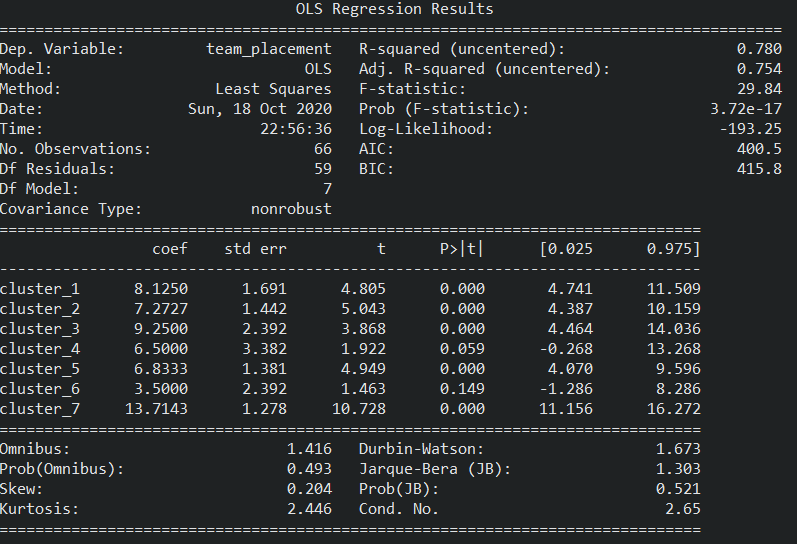
- Lastly, I created a simple OLS regression model to look closely at the relationship between “team_placement” and “cluster” variables. I want to see whether we can use this cluster to predict which team will have a higher chance at ranking higher in this tournament or any other tournament.
df_cluster = pd.get_dummies(df_player, columns=['cluster']).iloc[:,-7:]
kmeans = KMeans(n_clusters = kl.elbow, init = 'k-means++', random_state = 1).fit(data_scaled)
pred = kmeans.predict(data_scaled)
Overall Model Performance
Although there is not easy to evaluate an unsupervised machine learning model, because the “knee” cannot be easily identified in figure 23, I would say that our data is not good enough for the model to group different players.
Based on the OLS Regression Results in figure 25, both of the coefficients of determination values (R-squared and Adj R-squared) are above 0.75. I can say that the regression model fits the data well and it can explain the “team_placement” variable (dependent variable).
In the heat map below, I am only interested in the cluster row/column. Although player’s rank and “team_placement” are not the main determinants of the cluster, they hold the highest correlation compare to other variables. Those variables that also have big correlations are the ones that related to “kill” (and “kill_per_match”), “damages” (and “damages_per_match”), and “survival”. The one that has the lowest correlation is “accuracy”. This make sense because data patterns of the ones that have higher correlations can be easier to identify than “accuracy”’s pattern.
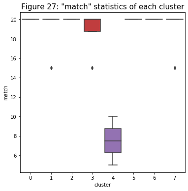
- Next, I created a series of relationship box plots of the cluster and other variables. The first one I want to look at is with “the “match” variable. Based on the figure below, it seems like the model does well in identifying which players are substitute players (cluster 4) and which ones are mains. Even though some main players got subbed and their total matches did not reach 20, the model did not categorize them as substitute players.
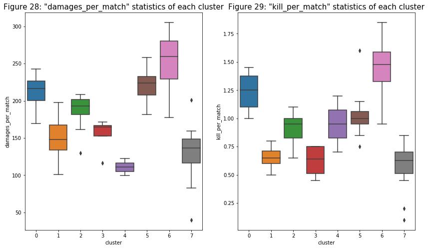
- In the relationships below, on average, cluster 6 has the highest damage and kill while the substitute group (cluster 4) has the lowest. Based on these relationships alone, I can tell that cluster 6’s players are the gunner of the team.
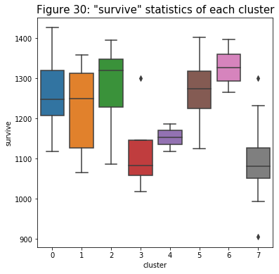
- The trend for the relationship with “survive” is similar to those above: cluster 6 leads with a higher overall average. But there seems to be a very similar pattern for clusters 0 and 7 compare to the previous relationships. Cluster 0 has very similar characteristics to the gunners from cluster 6. But cluster 7 seems to have a lower performance just by looking at the relationships I have so far (sometimes even lower than the substitute group).
- With this relationship below, I can identify two more groups that have similar characteristics with each other: clusters 2 and 5. Based on figures 28 and 29, both of them have higher damage but lower kill. But in this figure, it shows that they have very good assist statistics. This evidence suggests to me that those players in clusters 2 and 5 might be the supporters of the team.
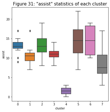
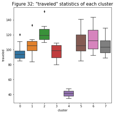
- The figure below displays a trend similar to the ones above. The only noticeable detail I see is, although their previous characteristics are very similar, the median for cluster 2 is a little bit higher compared to cluster 5. This might be the reason why the model separates the players into two groups. The player in cluster 2 might be the scout players of the team.
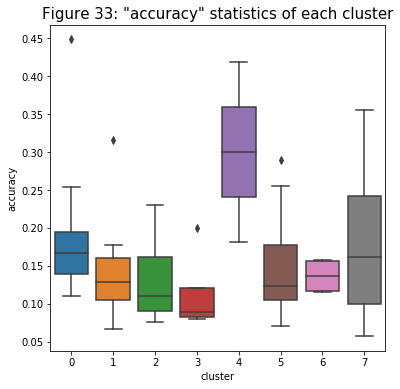
- The figure below is very interesting. It seems like the accuracy of the substitute group (cluster 4) and the worst-performing group (cluster 7) are, on average, higher compare with the rest. It makes sense because these two groups have the lowest ranges for the damage variable as well: it means that they tend to shoot when they know they can hit those shots.
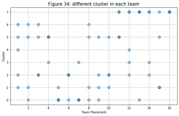
- Lastly, I created a scatter plot to see what type of player (define by cluster) does each team has based on the overall team’s placement. Although it is more clear than figure 24, it still quite hard to identify the trend of the plot. But it seems like the higher ranking teams tend to have players that are in cluster 0, 1, 2, 5, and 6 in their teams. As expected above, teams with players from cluster 7 placed poorly on the leaderboard (below top 10).
Conclusion
From the post model creation analysis that I did in the part above, I was able to label 6 groups out of the total 8 clusters the k-means model returned from the input data. First, I found out that cluster 4 is the substitute player. Based on having higher statistics for damage and survival time, both clusters 6 and 0 can be seen as the gunners of the teams. Another important position in the team is the supporter which is the label I have for clusters 2 and 5. The last group I could identify is cluster 7 being the worst-performing group. I could not determine clusters 1 and 3 because they do not have distinct characteristics. If I can collect more different data (such as health recovered, average kill distance, etc.), they might be more apparent when I am looking at those variables. Just from this model and the result, I believe the cluster model has done a good job of grouping players that are similar together.
One thing that surprised me was how high the correlation is between the players from different clusters in each team and the team’s overall placement (with Adj. R-squared value is 0.754). This means that there is a predictable pattern in which the team is more likely to have higher placement if it has certain types of players. This is a major finding that will help many PUBG esports analysis or PUBG esports organizations to take note if they want the team to perform better and win different tournaments. This information can help with anything from figure out what is the dynamic of the team should be to which player should they recruit for the team.
Personally, I feel that I have done a good job on this project. Because my main focus was data visualization and EDA, I have spent many hours exploring different plots and retrieve useful information. But I also believe that there are better ways to present the figures that I have above. One improvement I would have for this project is to find out the more advanced methodology to make the graph more beautiful and easy to read.
If I was to continue with this project, I would want to try out different numbers of k to compare the different results. Because I could only label 6 clusters, I would want to see what will happen if I reduce the k value to 6. The last thing I would want to do is to figure out what cluster pattern, specifically, will result in a higher team’s placement. With the information that I can get from it, I will have a higher chance of guessing whether my favorite team’s lineup will make me happy or sad in the next tournament.
Code
This project’s codes can be viewed at this GitHub’s repository.
Author
- Chi Lam, student at Michigan State University - chilam27
Acknowledgments
APAC PUBG Continental Series Charity Showdown 2020 Statistics
365 Data Science, “K Means Clustering: Pros and Cons of K Means Clustering.” Youtube, 24 Jan. 2019.